
As the 2027 Dulux Colour Forecast launches, we speak to Dulux Colour & Design Specialist Davina Harper about the colours, trends and cultural influences set to shape our homes and lifestyles in the year ahead. Drawing on extensive international research, including Milan Design Week, Davina shares her insights into how colour reflects the way we live, create and connect with our surroundings.
What stood out to you most when you were researching the colours for the year ahead?
At the heart of the 2027 Forecast is a desire for connection and authenticity. After years of highly curated, screen-led living, people are looking for homes that feel more personal, expressive and reflective of who they are, a desire for homes that feel more human, personal and lived-in.
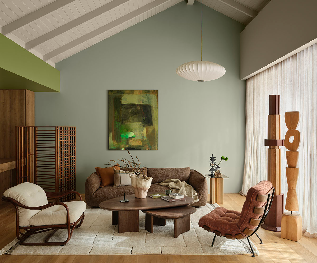
There’s a lovely tension in the 2027 forecast between calm and expression – we want our homes to provide a sense of refuge, but we also want them to tell our stories and give us permission to have a little more fun. That comes through differently across the three palettes.
Play is about spontaneity, imperfection and joyful self-expression; Treasure is richer and more layered, drawing on personal stories and collected pieces; while Sensory is grounded in everyday rituals, natural materials and creating a sense of calm and reassurance.
How much does what happens in fashion, art, travel and popular culture influence the colours we ultimately bring into our homes?
Travel is a huge source of inspiration for me, as well as art, design, fashion and architecture. I also find inspiration in everyday moments – nature, interesting colour combinations I notice when I’m out and about, and the way people personalise their homes and spaces.
The Colour Forecast itself comes from extensive year-round research into global and local trends, including events such as Milan Design Week, alongside international forecasting and Dulux’s global network. Ultimately, it’s about taking all of those influences and understanding what they say about the way we want to live.
Were there any colours or trends that surprised you?
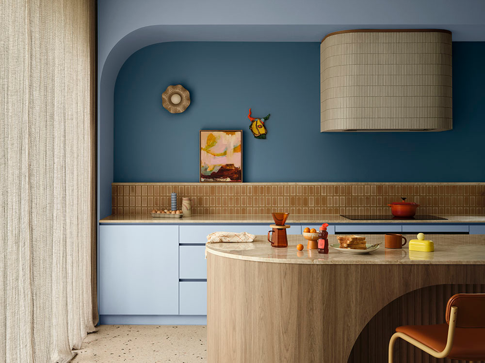
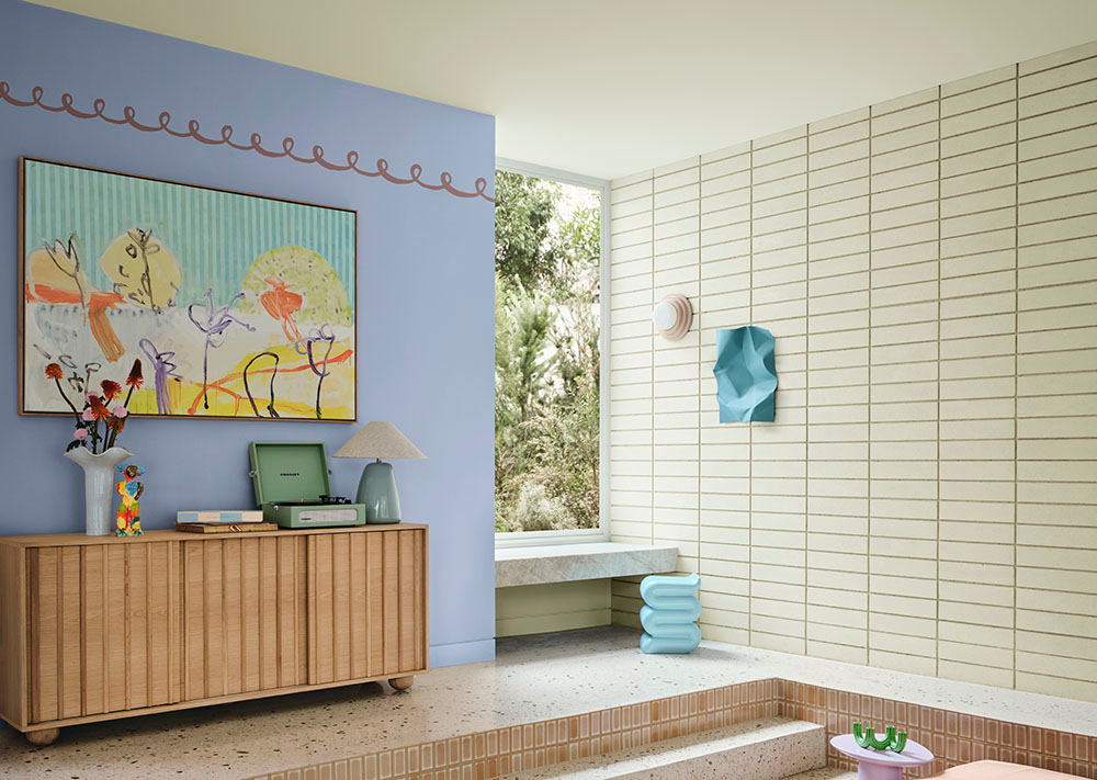
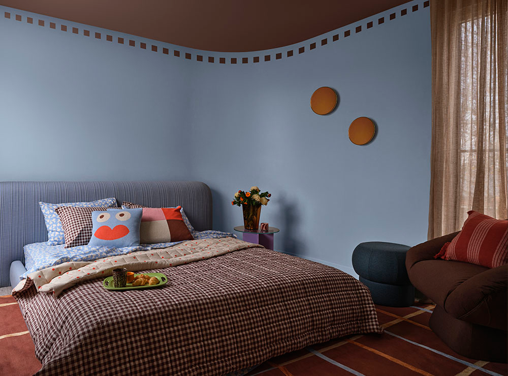
Blue is particularly interesting for 2027 because of its versatility. We’re seeing everything from soft greyed blues through to cornflower, periwinkle, teal and deeper tones, demonstrating how comfortably blue can move between being a feature colour and a grounding backdrop.
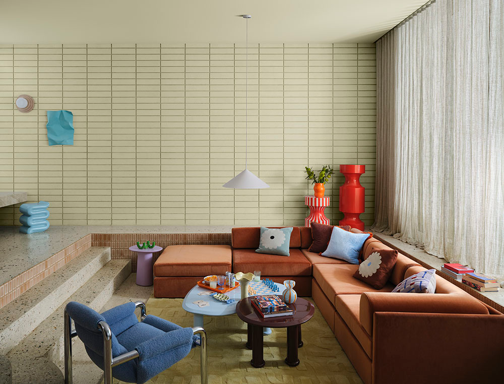
I also love some of the less expected combinations emerging for 2027 – softened yellow-greens and blues alongside berry, cherry and orange accents. They feel optimistic and expressive without being overwhelming.
How do you think our changing lifestyles are influencing the way we use colour at home?
We’re living in an increasingly fast, connected world, and that’s making us reconsider what we want our homes to provide emotionally. For 2027, we’re seeing a desire for spaces that feel grounded, restorative and deeply personal.
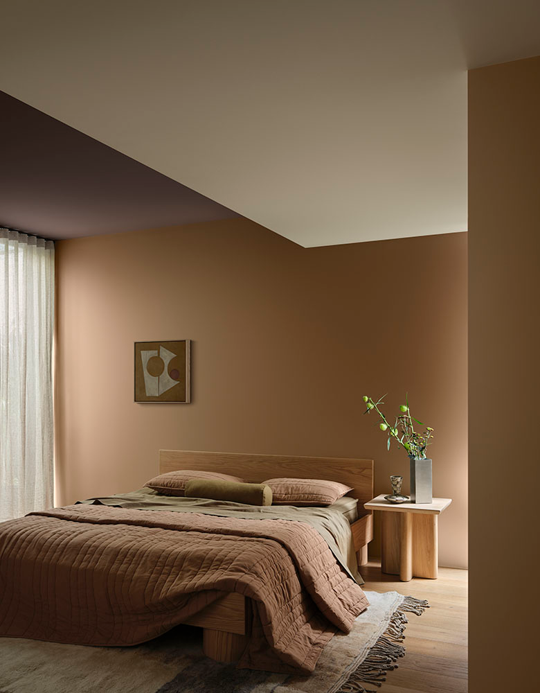
That’s particularly evident in Sensory, which celebrates simple rituals such as making tea, lighting a candle or sharing a meal. Paired with natural textures and craftsmanship, these elements help create a sense of reassurance and calm. At the other end of the spectrum, Play responds to our screen-led lives through analogue activities, spontaneity and spaces designed for interaction, creativity and evolving family life.
Ultimately, colour isn’t just decorative. It can help shape the feeling of a space and support the way we want to live, connect and feel at home.
Do you think we’re becoming more confident and expressive with colour in our homes, or are people still playing it relatively safe?
I think there’s definitely a growing confidence, but it doesn’t necessarily mean every room needs to be filled with bold colour. What’s changing is the desire for our homes to feel more personal.
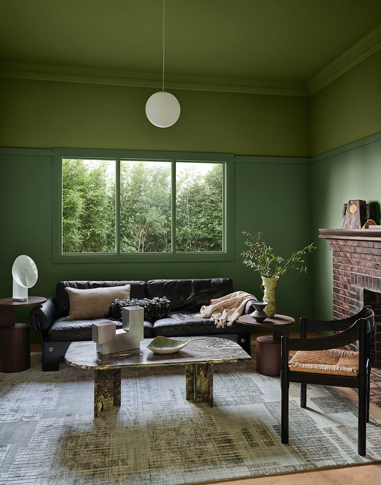
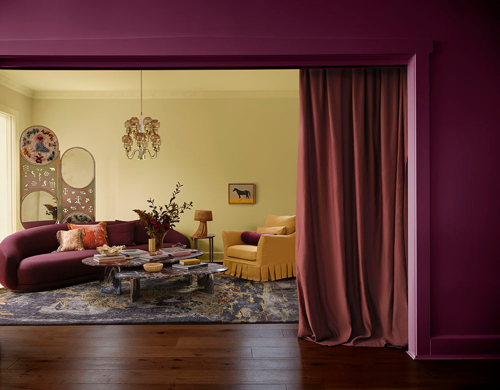
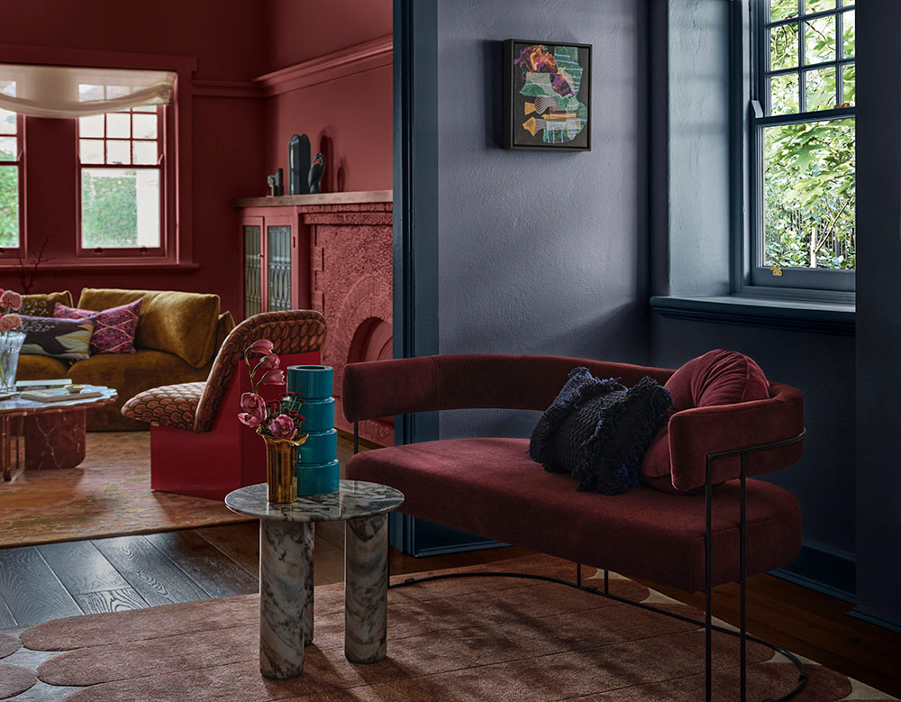
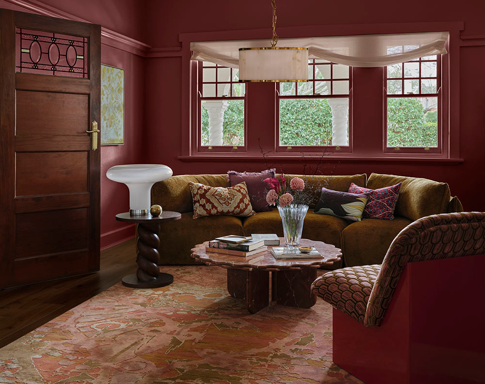
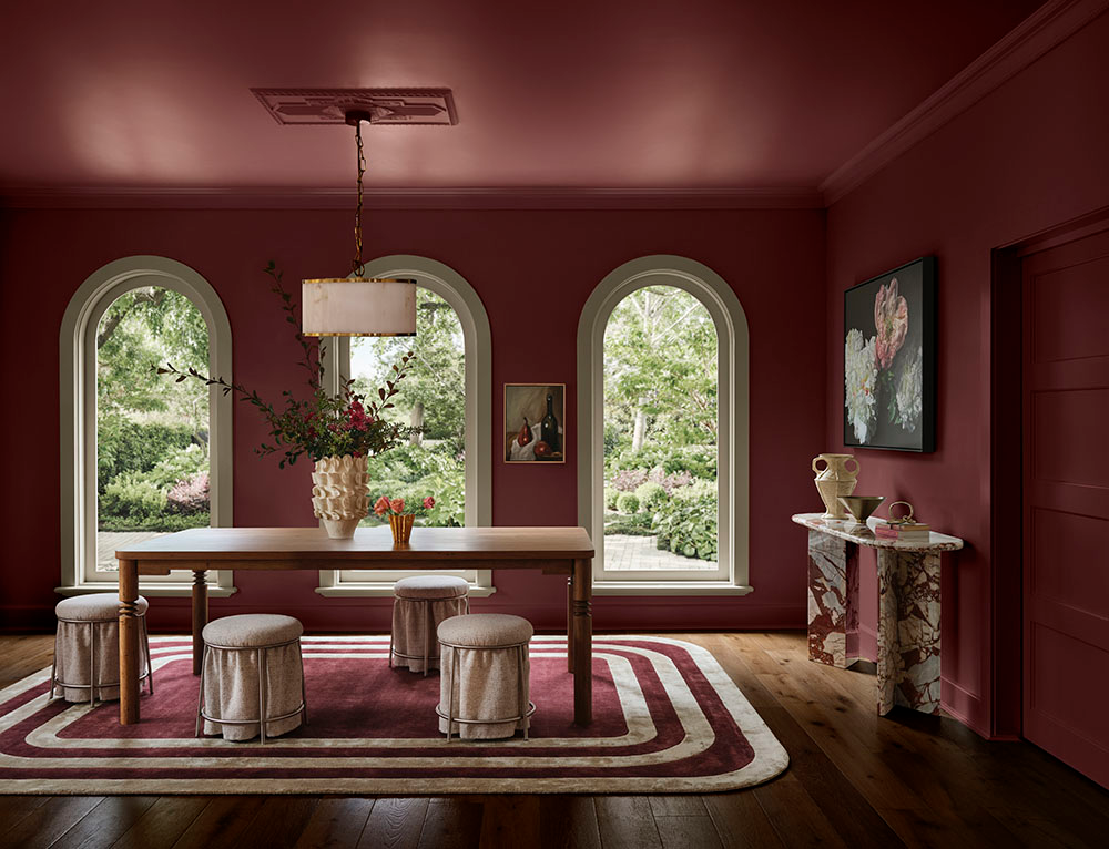
The 2027 palettes really encourage that personal expression. Treasure, for example, reflects a move away from stark minimalism towards a more restrained maximalism – layering richer colour, meaningful objects, different materials and pieces collected over time.
Play takes that confidence in another direction, encouraging unexpected colour combinations, hand-painted details and a little imperfection. There’s less pressure for everything to look perfectly curated and more freedom to create a home that actually feels like you.
That idea is very personal to me too. My own home is filled with favourite books, treasured objects from my travels, meaningful artwork and pieces that hold memories. I love the idea that together those things tell the story of the places we’ve been, the people we’ve met and the things that inspire us.
If someone wanted to bring a little more colour into their home, where would you suggest they start?
Start with a colour you genuinely love and think about how you want the room to feel. You don’t necessarily need to choose the boldest colour in the palette. Some of the softer blues, greens and mid-tones in the 2027 Forecast are incredibly easy to live with and can completely change the mood of a space.
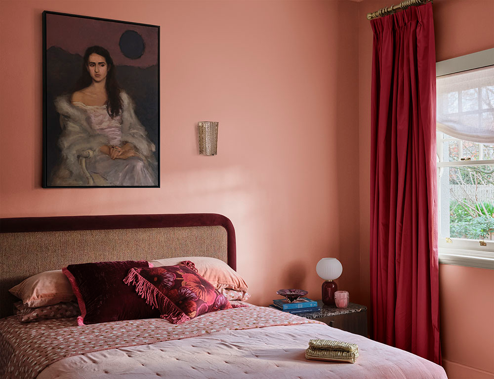
If you’re unsure where to begin, try a smaller area such as a feature wall, door or a room like a study, powder room or laundry. Mid-tones such as Dulux Canary Wharf or softer hues such as Dulux Muriwai Half can create an immediate sense of warmth, mood and cohesion, particularly in bedrooms and shared living spaces.
You can then introduce stronger colours through accents, furnishings or decorative details. For example, the Play palette combines tranquil blues with berry accents for warmth and personality, while Sensory pairs warm neutrals with fresh greens and greyed blues for something quieter and more restorative.
Most importantly, choose colours that feel like you. Colour is ultimately about creating a home that reflects who you are and finding combinations that bring you joy, whether they’re on trend or not.